
Midjourney Style Reference Case Study
Midjourney dropped a new feature call Style Reference. I decided to test it and compare the results using an image prompt and a style reference, while making changes to the prompt and the parameters.
Observations and results below.


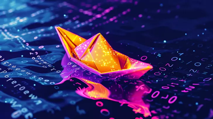
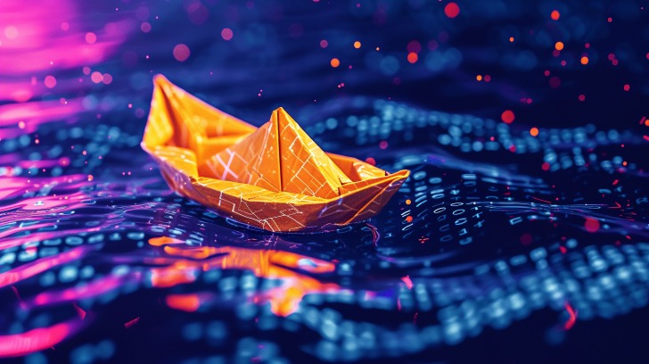
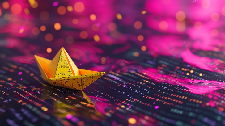
I started with an image promote of a yellow origami boat and a style reference of a blond woman in saturated neon type colors.
The prompts for these two images:
yellow origami boat on a sea of computer code –ar 16:9 –v 6
woman with long blond hair, saturated pink, purple, and black, anime style –ar 16:9 –v 6
Run 1:
I decided to use only the boat prompt on this run and add ‘neon pink’
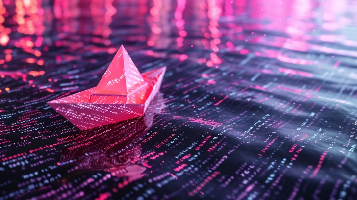
neon pink origami boat on a sea of computer code –ar 16:9 –v 6 –sref [url]
Observations: – “yellow” is a strong influence from the boat image.
Run 2:
Prompt elements from both images pink origami boat in a sea of computer code, vibrant, saturated pink, purple and black colors –ar 16:9 –v 6 –sref [url]
Observations: – boats in the images lost some crispness – due to added words in the prompt? (that is the only change).


Run 3:
non-specific boat color. I removed the “pink” color for the boat. origami boat in a sea of computer code, vibrant, saturated pink, purple and black colors –ar 16:9 –v 6 –sref [url].
Observations:
- Sharpness is back on the boat
- interesting
Do we have a sinking ship

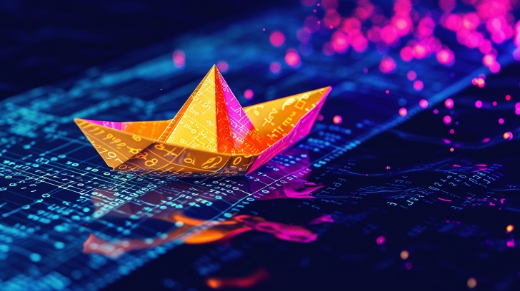
Run 4:
Slight prompt adjustment.
Added: anime style (from style ref. prompt) origami boat in a sea of computer code, vibrant, saturated pink, purple and black colors, anime style –ar 16:9 –v 6 –sref [url].
Observations:
- slight changes in the boat, geometric.

Run 5:
Midjourney Stylize parameter tests.
With simplified boat prompt.
origami boat in a sea of computer code –ar 16:9 –v 6 –sref [url] –s [add value]
Below:
–s 50
–s 250
Observations:
- no significant differences

–s 50

–s 50
–s 250
–s 250
–s 500
–s 750
–s 1000
Observations:
– quite difficult to see significant differences, may be slightly sharper going to higher stylize value
On occasion I still got “fuzzy boats” too but less than in the lower stylize values.
Observations:
- all boat are crisp and sharp (occasional loss of sharpness using a style reference?)

–s 500

–s 750

–s 1000
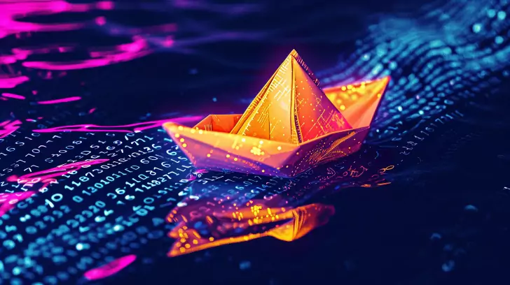
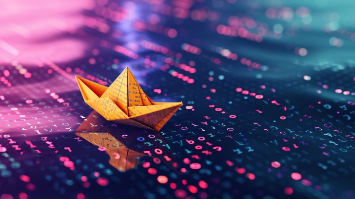
Run 6: no style reference, yes image prompt.
Combined text prompts from boat and girl (the colors).
origami boat in a sea of computer code, vibrant, saturated pink, purple and black colors –ar 16:9 –v 6.
I wanted to see if/how much the style reference affects the image.
Observations:
- all boat are crisp and sharp (occasional loss of sharpness using a style reference?)


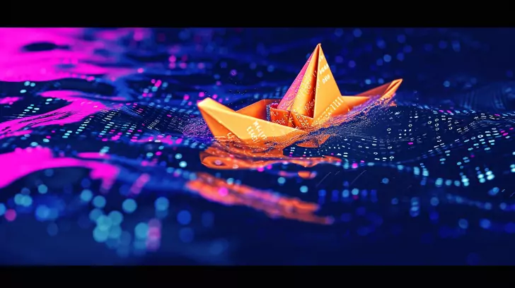
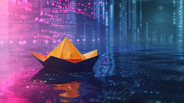
Run 7: same as run 6 with addition of anime style.
origami boat in a sea of computer code, vibrant, saturated pink, purple and black colors –ar 16:9 –v 6
Observations:
- no significant differences
- some outputs included a vertical lights type background (see 1st image below)


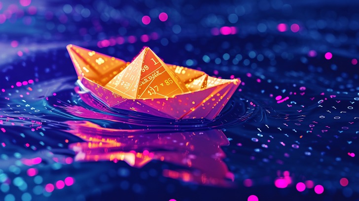
Run 8: Tests with style weights –sw.
This time I want to see what difference if any, adding style weights does.
All previous runs has used the default –sw of 100
origami boat in a sea of computer code –ar 16:9 –sref [url] –sw [value] –v 6
This batch:
–sw 0
Observations:
- wow – sharp and crips, but! style weight is non-existing – meaning do I then even need to use it?


tyle weights continued…
same prompts as above
–sw 250
–sw 500
Observations:
– boats look fuzzier in the about 50%+ outputs
–sw 750
–sw 1000
Observations:
– more fuzzy boats, otherwise crisp
– no significant differences

–sw 250

–sw 500

–sw 750
–sw 1000
Just combined text prompts of the two images. Left out the color of the boat. origami boat in a sea of computer code, vibrant, saturated pink, purple and black colors –ar 16:9 –v 6


Run 10: no style reference, no image prompt
Added “yellow” to the prompt
yellow origami boat in a sea of computer code, vibrant, saturated pink, purple and black colors –ar 16:9 –v 6
Observations:
- another wow (totally subjective haha)


no reference, no image prompt
added “anime style”
yellow origami boat in a sea of computer code, vibrant, saturated pink, purple and black colors, anime style –ar 16:9 –v 6


Summary
Ok I could keep going on using image weights etc., but that’s for another time.
Let’s wrap it up.
Notes:
- Adding stylize or style weights didn’t make a large, significant difference
- Higher style weight values increased “fuzzy boat” outputs, about 50% of the time.
- Zero style weight resulted in crisp image that look very similar to original image reference.
- Using full prompts, vs. shortened prompts didn’t result in significant changes.
- Similar outputs are possible even without using the style reference and/or the image references.
- Adding stylize did not result in significantly different image outputs.
So what should you do? It depends. Do you have a destination? Are you just playing around?
Experiment. Observe. Evaluate.